The project
We offered to help out a local residents association with their community website, as it had been left alone for too long and was in need of technology, design, content updates and accessibility fixes.
The old site was running on an out-of-date version of a CMS, so our first port of call was to work out if this was still required, and if so to get it updated to the latest version.
What many people don't realise is that Content Management Systems are software and need security and maintenance updates reasonably frequently so you're not in danger of hackers breaking in and ruining your site, or stealing your data. They're not a 'fire and forget' thing, so if they're not absolutely needed you shouldn't opt for one!
In this scenario, it's likely several different people would be updating the site after our updates so we opted to get the latest version of the CMS installed and put our focus into streamlining and re-organising the content and design of the site and creating new, standards-compliant and accessible templates for it.
The site wasn't set up with a secure certificate, and as most good hosting providers now let you do this for free (and Google rank secured sites more highly most of the time), it made sense for us to do this too.
Our aims
- Assess current sitemap
- Update page content where necessary
- Remove unnecessary pages or combine short pages into better-organised longer pages of useful content
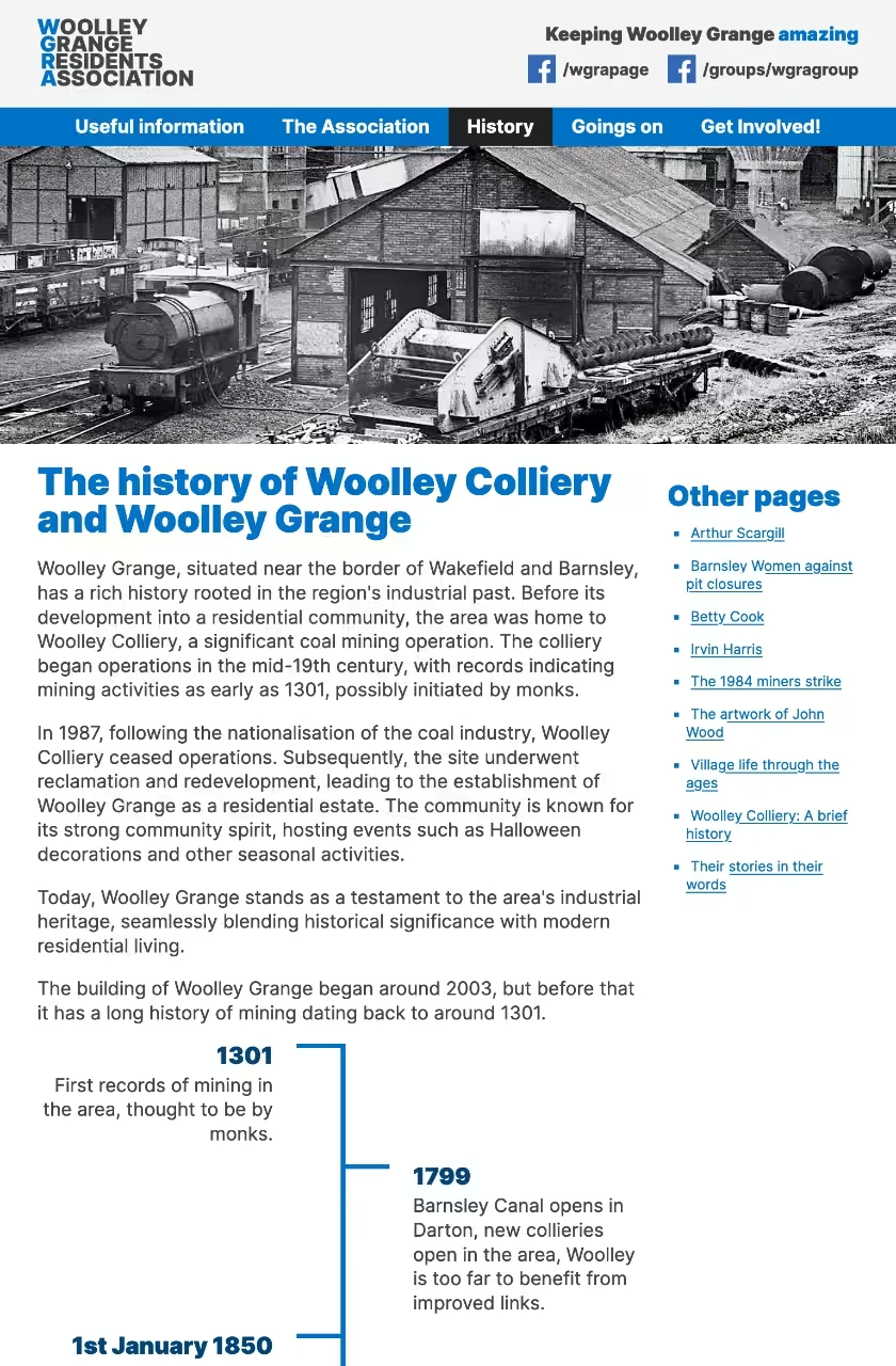
- Improve mobile and tablet experience
- Modernise the look and feel of the site - the template previously used was anything up to 16 years old in places!
- Fix spelling and grammatical issues as we updated content pages
- Introduce better signposting of important content
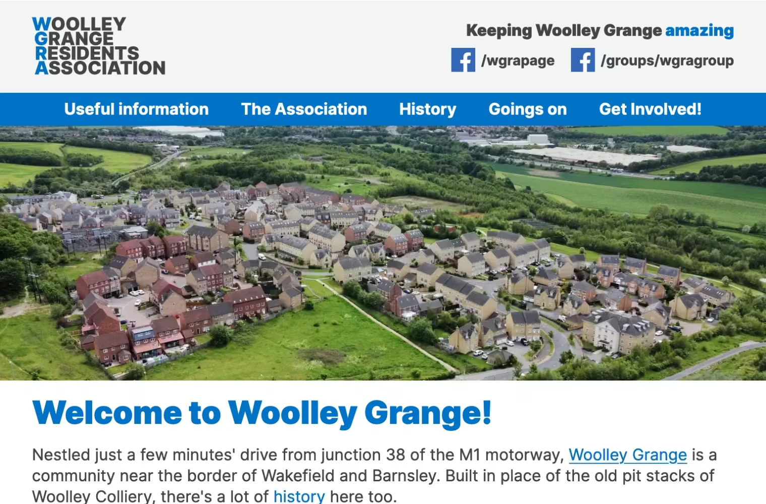
- Make the design more appealing by introducing a bit of nice photography
- Add an SSL certificate
Colour palette
The first thing we needed was a colour palette, and we got most of it directly from the old site: blues, greys, black and white.
-
- Sand
- #f4f4f4
- rgb(244 244 244)
- hsl(0deg 0% 96%)
-
- Ocean
- #00447c
- rgb(0 68 124)
- hsl(207deg 100% 24%)
-
- True
- #0072c8
- rgb(0 114 200)
- hsl(206deg 100% 39%)
-
- Prussian
- #002e54
- rgb(0 46 84)
- hsl(207deg 100% 16%)
-
- Tuatara
- #444
- rgb(68 68 68)
- hsl(0deg 0% 27%)
-
- Dark
- #222
- rgb(34 34 34)
- hsl(207deg 0% 13%)
The old site had a big main navigation section which had some keyboard navigation issues that 'collapsed' into a drop-down ('select') element which can be an accessibility issue for some visitors. We massively reduced the menu from 33 items down to a much more easy-to-scan five. We also ditched the site search, because content would now be easier to find (plus site search plugins in our experience never really do what people expect - they're never going to be as clever as Google).
Adding images to the new site in more places meant that overall some of our pages were now larger in terms of file size, but to even out that (and because we really believe that the images were needed) our pages requested 11 fewer files on page load. This means we've radically improved the look, feel, consistency of design and kept the page load really quick.
Using Google's Page Speed Insights tool, we found that the old site was actually pretty nippy overall (93/100 on mobile, 97/100 on desktop), so there wasn't a great deal of work to do here - mostly just ensuring we didn't make it any slower! In fact, we still managed to improve the overall scores. It's now sitting at 97/100 on both mobile and desktop.
From a technical perspective, we ensured that:
- The code we output was minified/compressed to remove whitespace and make the file size smaller
- We compressed images to a sensible level, again making file sizes smaller
- We removed third-party libraries from the site and only added code that was actually needed
- We added some futuristic fancy code that tells your web browser to prioritise certain files
- We reduced the number of files the site needed to fetch to load a page, meaning the site feels snappy and quick to load - and it actually is!
Core Web Vitals and page stats
New site (desktop)
Performance:
100%
Accessibility:
100%
Best practices:
100%
Search Engine Optimisation:
100%
Full details
-
Largest Contentful Paint:
0.6s
Success: < 2.5s Warning: 2.6s - 4s Error: > 4s
-
First Contentful Paint:
0.3s
Success: < 1.8s Warning: 1.81s - 3s Error: > 3s
-
Speed Index:
0.3s
Success: <3.4s Warning: 3.5s - 5.8s Error: > 5.8s
-
Cumulative Layout Shift:
0
Success: < 0.1 Warning: 0.11 - 0.25 Error: > 0.25
-
Total Blocking Time:
0ms
Success: < 200ms Warning: 201ms - 600ms Error: > 600ms
-
Page weight:
548KB
Success: < 1.50MB Warning: 1.50MB - 2.23MB Error: > 2.23MB
New site (mobile)
Performance:
94%
Accessibility:
100%
Best practices:
100%
Search Engine Optimisation:
100%
Full details
-
Largest Contentful Paint:
3s
Success: < 2.5s Warning: 2.6s - 4s Error: > 4s
-
First Contentful Paint:
0.9s
Success: < 1.8s Warning: 1.81s - 3s Error: > 3s
-
Speed Index:
2.1s
Success: <3.4s Warning: 3.5s - 5.8s Error: > 5.8s
-
Cumulative Layout Shift:
0
Success: < 0.1 Warning: 0.11 - 0.25 Error: > 0.25
-
Total Blocking Time:
0ms
Success: < 200ms Warning: 201ms - 600ms Error: > 600ms
-
Page weight:
548KB
Success: < 1.50MB Warning: 1.50MB - 2.23MB Error: > 2.23MB
Tech used
- Eleventy: static site generator
- Sanity: headless CMS
- PostCSS: for CSS niceties
- Gulp: For front end build tasks
- Continuous Integration/Continuous Deployment (CI/CD) on Vercel
Job well done
We say this quite often, but we're pretty chuffed with this site. It's now more modern, more readable, more responsive, easier to navigate, and performs just magnificently. Not only are we chuffed with it, but the Residents Association are too - which is the whole reason we do what we do!
“I wanted to extend our heartfelt gratitude for the incredible website you have built. Your dedication, creativity, and hard work have truly transformed our online presence. The new website is not only visually appealing but also highly functional and user-friendly. Your efforts on top of a busy day job have made a significant impact on our community, and we are deeply appreciative of the personal time and expertise you have invested in this project. You have created something truly amazing where others have failed in the past. We are so fortunate to have a volunteer as talented and committed as you in our community and appreciate all the time you give to advise WGRA on all IT related issues.”


